Why Monochrome & Neutral Palettes Define Minimalism
Minimalism, as a design philosophy, has captivated the hearts of many, offering a breath of fresh air in a world often cluttered with excess. Central to this aesthetic is the use of monochrome and neutral palettes, which embody the very essence of minimalism. This blog post explores why these colour schemes matter in minimalist design. It looks at their importance, uses, and how they help create calm and harmonious spaces.
Minimalist colour schemes are simple and elegant. They are not just a style; they reflect a lifestyle choice. In a world full of noise, neutral decor and white space create a peaceful retreat for the mind and soul. We’ll look into why monochrome and neutral palettes are so popular in minimalist design. These colours help create a calm and balanced space.
Key Benefits / Why It Matters
The Essence of Minimalist Colour Schemes
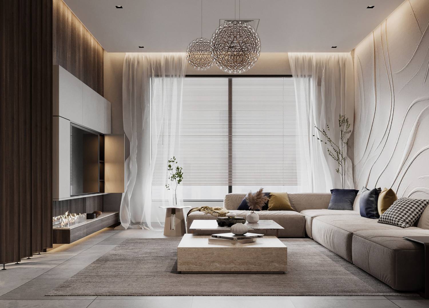
Minimalist colour schemes are grounded in the philosophy of less is more. These palettes remove extra elements. This way, they show the beauty of simplicity and let the space’s natural qualities shine. Monochrome and neutral tones act like a blank canvas. They provide versatility and timelessness that go beyond short-lived trends.
Neutral decor, with its soothing hues, creates an atmosphere of calm and relaxation. These colors, from soft beiges and grays to bright whites, create a feeling of space and openness. This makes them perfect for modern living areas. Without bold colors, we can focus on form, function, and how light and shadow interact. These are key parts of minimalist design.
Real-Life Applications and Data-Backed Insights
A study from the University of Texas found that neutral color schemes lower stress. This is true when compared to spaces with bright, clashing colors. This finding highlights how minimalist design can boost mental well-being. Monochrome and neutral colours are key to this effect.
Minimalist colour schemes are common in many areas, like architecture, interior design, fashion, and graphic design. These palettes provide consistency and coherence. This helps blend different elements for a harmonious and cohesive look.
Step-by-Step Guide / Actionable Insights
Creating a Minimalist Space with Monochrome and Neutral Palettes
Step 1: Understanding the Colour Wheel
Before starting a minimalist design journey, it’s important to know the colour wheel and how different hues relate to each other. Monochrome means one colour in different shades. Neutral palettes have soft tones that work well together. Getting to know these concepts will help you choose the right colours for your space.
Step 2: Choosing the Right Base Colours
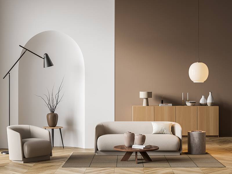
Select a base colour that aligns with the mood and function of the space. For example, whites and light greys create openness and purity. Warmer neutrals like taupe and beige bring warmth and cosiness. Consider the natural light in the room, as it will influence how the colours are perceived throughout the day.
Step 3: Incorporating Texture and Layers
To prevent a monochrome or neutral space from feeling flat or sterile, incorporate texture and layers. Use a variety of materials such as wood, stone, and textiles to add depth and interest. Textured cushions, woven rugs, and natural wood furniture add nice contrasts. They boost the look without breaking the minimalist feel.
Step 4: Emphasising White Space Design
White space, also known as negative space, is a fundamental principle in minimalist design. It refers to the empty areas around and between objects, allowing them to breathe and be appreciated. In a minimalist setting, white space design is crucial for maintaining balance and avoiding visual clutter. Be intentional with the placement of furniture and decor, ensuring there is ample space for movement and reflection.
Examples, Case Studies, or Statistics
Think about famous minimalist architects like John Pawson. His designs show the beauty of monochrome and neutral colours. His projects feature clean lines and simple spaces. They show how a limited colour palette can make places both useful and beautiful.
Additional Expert Tips & Common Mistakes to Avoid
Best Practices for Minimalist Colour Schemes
- Consistency is Key: Maintain a consistent colour palette throughout the space to ensure a cohesive look. This doesn’t mean everything must match, but the colours should go well together.
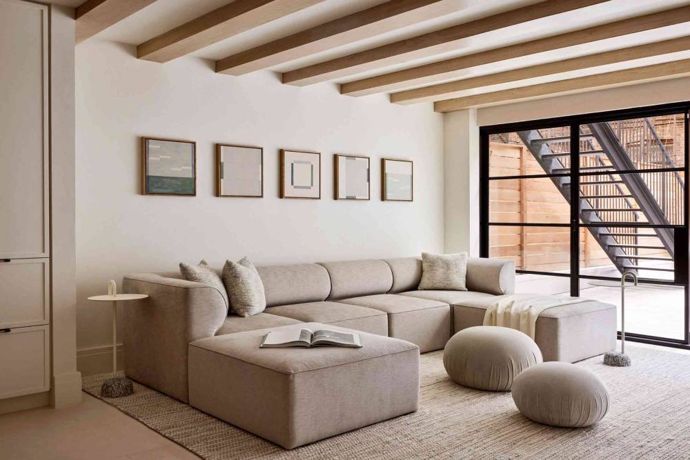
- Balance Warm and Cool Tones: Stick to a neutral palette. Mix warm and cool tones. This helps the space feel just right, not too cold or too warm. This balance adds depth and interest.
- Use Accent Colours Sparingly: If you choose to incorporate accent colours, do so sparingly. A single pop of colour can add interest without overwhelming the minimalist aesthetic.
Common Mistakes and Misconceptions
- Overlooking the Importance of Light: Lighting plays a critical role in how colours are perceived. Ensure the space is well-lit, using natural light where possible, to enhance the beauty of the neutral palette.
- Your personal style: Minimalism means simplicity, but it shouldn’t erase your personality. Incorporate personal touches and meaningful objects to make the space feel like home.
- Fearing Monotony: Some may fear that a monochrome or neutral palette will be boring. By adding texture, layers, and smart design elements, these palettes become lively and interesting.
Advanced Insights / Expert Recommendations
Unique Industry Perspectives
Minimalist design is not just about aesthetics. It’s a lifestyle choice that promotes sustainability and mindful living. Using monochrome and neutral colours helps people prioritise quality over quantity. They can select timeless pieces that last, instead of falling into fast fashion and throwaway decor.
Lesser-Known Insights
The rise of digital minimalism has also influenced physical spaces. As our lives become increasingly digital, the need for calming, clutter-free environments has grown. Monochrome and neutral colours make a great background for tech. They help screens and devices blend in instead of standing out.
The Timeless Appeal of Monochrome & Neutral Palette
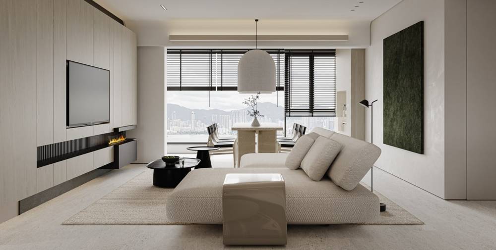
In conclusion, monochrome and neutral palettes are key to minimalist design. They provide a timeless, versatile, and calming look that fits the modern lifestyle. Using these colour schemes, people can create peaceful, clear, and healthy spaces.
As you start your minimalist design journey, keep balance, texture, and personal expression in mind. If you’re redesigning your home or just decluttering, use minimalism. It can lead you to a more intentional and fulfilling life.
What are your thoughts on minimalist colour schemes? Have you incorporated monochrome or neutral palettes in your own space? Share your experiences and insights in the comments below. Let’s continue the conversation and inspire one another to embrace the beauty of simplicity.
